Your website is the most important piece of your digital storefront.
At the end of the day, parents want the best for their children. A great childcare website design helps you build a relationship with those parents based on expertise, authority, and trust. It proves to them your school is the best option for their child, and they may decide to enroll before they even walk through your door.
But a subpar website will cause you to lose parents to your competitors.
First Impressions Matter
Take a moment to look at the two houses below. Imagine both are for sale.

Let’s say you’re looking for a new home and you drive by the house on the left. Would you stop and go in for a tour? Or, would you send your kids inside for a playdate?
No way, right?
What if that house represents your website?
Your website is your first impression. It informs parents of the quality of your entire childcare center. It sets their expectation — fair or not.
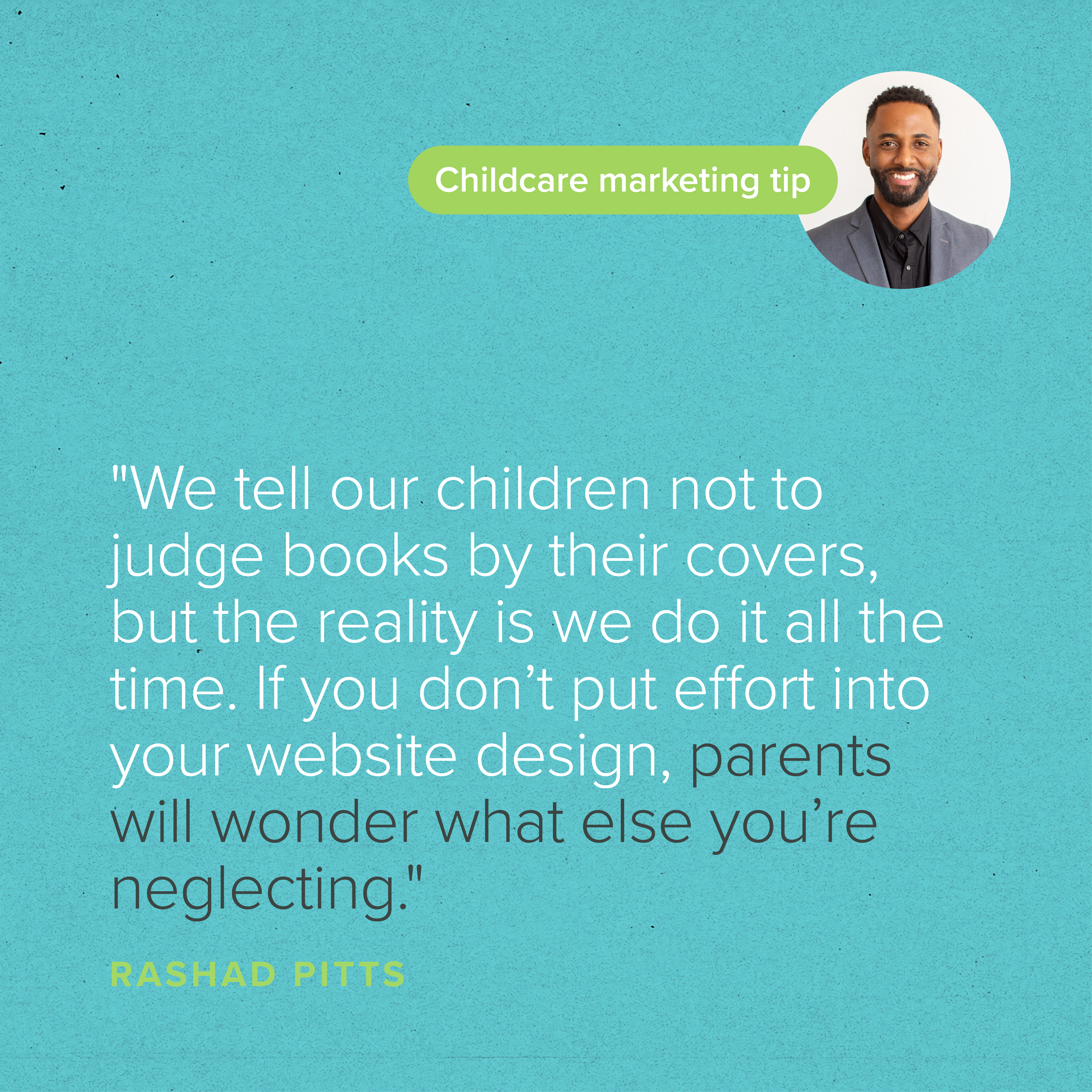
If your site doesn’t look great, loads slowly, is complicated, and/or is hard to navigate, parents will assume those qualities are reflected in your childcare center, regardless of whether it’s true. We tell our children not to judge books by their covers, but the reality is we do it all the time. If you don’t put effort into your website design, parents will wonder what else you’re neglecting.
But if your site is engaging, welcoming, and informative — like the house on the right — parents automatically expect that your school will be, too. When parents view high quality and attention to detail on the front end, they assume it’s also present on the back end in the form of high-quality care.
This is part of building trust.
No one wants to look for a solution to a problem by taking a complicated path. No one wants a difficult, exhausting experience. If the journey on the front end isn’t easy, or not as easy as a competitor’s, parents will pick the easier option.
On a more technical note, Google doesn’t reward sites that frustrate their users. The worse the user experience, the more your site will be penalized from an SEO perspective.
With all that in mind, it’s in your best interest to make your childcare website design as attractive and user-friendly as possible, so your first impressions are always exceptional.

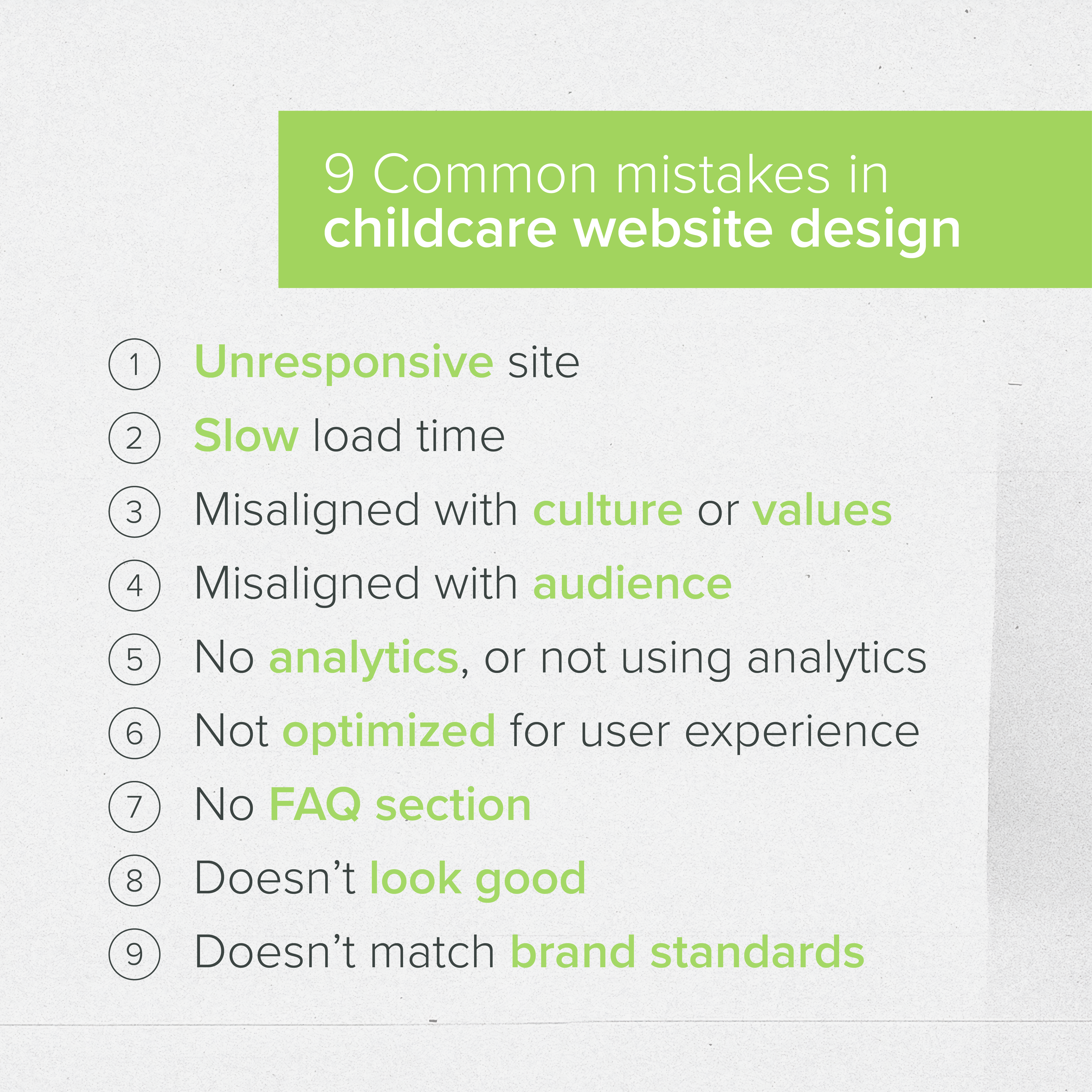
9 Common Childcare Website Design Mistakes
When it comes to childcare website design, we’ve noticed nine common mistakes and missed opportunities owners can make that hurt their enrollment. Let’s identify and explore each of them.
1. Unresponsive Site
As of 2022, 62% of online traffic comes from mobile devices, and that number is rising. If your website isn’t optimized for mobile, you’re not only being penalized by Google, your users are having a terrible experience.
2. Slow Load Time
A slow load time also impacts user experience. In the digital world, people are used to everything being instant. If it takes a while for a page to load, parents won’t wait around — they’ll bounce.
As humans, we have very short attention spans and are naturally impatient. We want everything “microwaved,” or served up instantly. Users won’t reload pages or wait for slow ones.
3. Misaligned With Culture or Values
Pay attention to all the aspects of your messaging on your website — the copy, images, look, and feel. Do they accurately represent what you stand for?
Do they convey your conviction to help children? Do they showcase your culture and values? Do they give parents the peace of mind they need to make a decision?
All aspects of your messaging should align and connect with the values that drive your school.
Parents often decide where to send their child before they ever schedule a tour. Help them confirm their decision by making the choice clear on your website. Point out your differentiators so you stand out from the competition.
4. Misaligned With Audience
When your website is misaligned with your audience’s expectations, your messaging feels inauthentic. From stock photos of school-age children on the infant program page to incorrect enrollment dates, simple errors are missed opportunities for connection.
Details matter. Pay close attention and make sure facts are consistent throughout your entire website.
5. No Analytics or Not Using Analytics
Make sure you have analytics installed on your website, and use them to inform your business decisions. Without analytics, you don’t have data to examine and learn from, and you don’t have any way of knowing what to adjust and how to improve.
6. Not Optimized for User Experience
If your childcare website design creates a poor user experience, Google will penalize you. Why would Google tarnish its credibility by showcasing a website that doesn’t provide a solution to its customer?
They won’t.
So, make sure your website avoids too much text, too much navigation, and too many or too few pages. Make sure all your links work correctly and aren’t broken (don’t go to 404 error pages). Finally, follow best practices when it comes to things like formatting and SEO.
By following best practices, you’ll be in good shape, and you’ll provide users with have a great experience.
7. Not Answering FAQs
Create a designated section or page to answer parents’ most frequently asked questions. This simple tactic not only thrills parents and convinces them of your expertise and authority, but it also saves your staff some time.
8. Just Doesn’t Look Good
Is your childcare website design welcoming? Does it speak to your audience? Is it consistent?
Remember that your website should tell your story. It should express your authority and build trust with your audience.
If it isn’t doing that, it’s time for a change.
9. Doesn’t Match Brand Standards
When we talk about brand standards and consistency in branding, we mean everything all across the board, from your digital storefront to your brick-and-mortar building.
If someone visits your website and then drives by your school and sees different logos or colors, they’ll think they’re in the wrong place. It won’t look right, and it’ll give the wrong impression.
Consistency is key, and it has to be perfect across the board.
Childcare Website Design: No More Mistakes
Diagnosing problems in your childcare website design is only half the battle. Once you recognize the problems, you have to address them.
We at Rose Marketing Solutions are experts at helping our clients make incredible first impressions and fill classrooms. Contact us today if you’d like to upgrade your website or digital marketing strategy.

Subscribe
Sign up with your email address to receive news and updates.

